Mobile Website Design: The 10 Best Mobile Website Examples 2025
Updated Apr 25, 2025 | Published Apr 17, 2025 | 11 min read
Updated Apr 25, 2025 | Published Apr 17, 2025 | 11 min read

If you’ve created your new website on a PC and you’re sitting back admiring how lovely it is, don’t relax just yet. As important as the desktop version of your site is, you’re not done until your mobile website design is equally good.
More than half of all web traffic comes from mobile devices, so if you want to reach as much of your target audience as possible, your mobile website must function beautifully. Every business, from a tiny startup to a huge global brand, needs a mobile-friendly website that is both attractive and responsive.
In this article, we select 10 websites with spot-on mobile versions that create a seamless user experience. If you want to nail your mobile optimization in 2025, these are the guys to take inspiration from.
Gone are the days of a mobile website being a shrunken version of the one for desktop computers. If you’ve recently come across a website where that was the case, chances are you hit the back button pretty quickly.
The mobile experience must align with the behavior of your site visitors on the move and provide easy access to the same functions as your full website, but on a smaller screen. Since 2020, Google has used mobile-first indexing, meaning that your position in search results is based on your mobile site first. Higher rankings on search engines mean more traffic.
Your website is users’ first impression of your brand, so you want to make sure that your mobile site comes across as professional and builds trust with your future customers.
Browse trending website templates from Friday.
Every website is different, but the best mobile sites all have a few things in common, and looking great is only a small part of it.
With a responsive mobile website design, content will automatically resize to fit the mobile screen. This adaptability means users don’t have to zoom in or scroll left and right to see all of the content on a mobile device.
According to Google Consumer Insights, if a website takes more than three seconds to load, more than half of mobile users will leave the page. With such a short window to impress smartphone users, a fast-loading mobile site is essential.
If mobile users need to squint or zoom in just to read the first few lines on their screen, they are unlikely to hang around. As well as choosing a clear font and appropriate size for your mobile and desktop site, break up large walls of text by using short paragraphs and enough headings to allow them to skim the page and find what they’re looking for.
Ensure that the menus on your mobile website are straightforward and intuitive. If users need to hunt for what they’re looking for, they are likely to give up and go elsewhere.
If someone on your mobile website wants to take the next step in the user journey, don’t make them work for it! Have bold, concise Call-to-Action buttons throughout each page of the mobile screen, and ensure they link to the correct destinations.
Learn more: Website design timeline from planning to launch.
Great mobile websites don’t rely on trends. They focus on speed, clarity, and smooth user flow. These examples show how strong design choices create better desktop and mobile experiences from the first tap.

The Starbucks mobile website design is attractive and user-friendly, perfectly showcasing their familiar branding. The theme is minimal, against a white background, but the pops of color throughout make it easy on the eye and fun to navigate.
The mobile site is well laid out, and with just a couple of clicks, you can access your favorite food and drinks and their comprehensive individual pages. Each product page provides nutritional information about the various sizes and customizations available, allowing you to know the calories and nutritional content of your order well in advance.
As one of the top food brands in the world, Starbucks faces pressure to deliver on its mobile site, and it manages to meet expectations. With a simple layout and attractive design, ordering coffee on the go is a piece of cake.
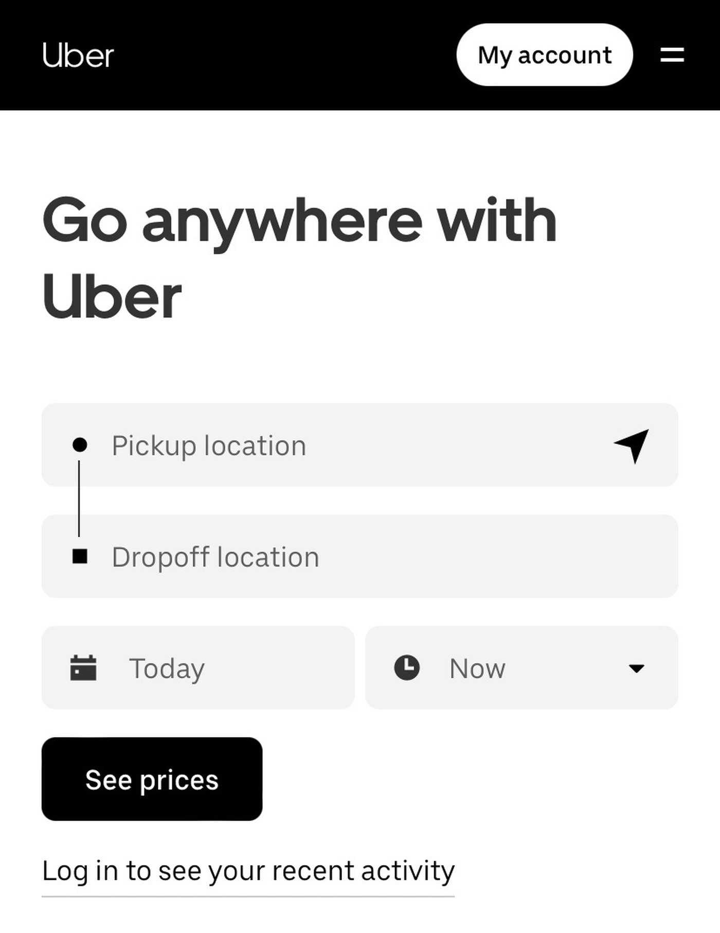
The Uber mobile website is a clear lesson in matching your web design with the needs of site visitors. Those who want to hail a ride need a simple site with straightforward navigation, and the mobile-friendly Uber site provides that.
Above the fold on the homepage, there is only one feature: add your current location and destination, and find out how much it will cost. Since the vast majority of users will be employing this feature, it makes it incredibly user-friendly and convenient.
Further down the homepage are secondary features, such as reserving a ride in advance or requesting courier services. These buttons are accompanied by simple icons that help users quickly find what they need. The expandable menu in the top right corner leads to clearly labeled categories and includes a link to Uber Eats, too.

BMW’s mobile website design feels just as it should—fast, sleek, and luxurious. Scrolling the homepage showcases the brand’s featured cars, and clicking on any of them takes users to a detailed, dedicated page for that vehicle.
One standout feature of their mobile website design, halfway down the homepage, is the ability to design your own BMW, a feature that is just as much fun on mobile as it is on the desktop layout. The rest of the site is intuitive, and users know exactly where each link will take them, allowing them to shop for luxury cars effectively on the go.
Whether scrolling through the color schemes or choosing a technology package, the site smoothly transforms the animation to reflect your choices.
Throughout the mobile-friendly site, there are obvious call-to-action buttons, allowing users to easily take the next step toward buying a new car and experience the essence of the BMW brand.

Gucci’s mobile website is dripping with style, just as you would expect from the leading luxury fashion brand. As soon as you arrive on the homepage, you’re met with bold, colorful images against a plain background. Scrolling reveals several video clips of a similar nature.
The entire business website feels sophisticated and sleek, appealing to the target market. Shopping categories are easy to navigate, and once you’re inside an attractive product page, the ‘Add to Shopping Bag’ button is bold and easy to find.
Taking the next step in the customer journey is just as easy on mobile as on desktop. The various appointment and delivery options are clearly displayed on the homepage, making it easy to complete and order from your mobile device.

Puffin Packaging’s mobile-friendly website is an example of how a site can focus on functionality while still looking good. Its minimalist look is combined with bright visual content, making it an attractive site that is optimized to convert users into customers.
With a ‘Get a Quote’ call-to-action right at the top of the homepage, this site isn’t messing around. There are various other CTAs as you scroll down the homepage, leading users to find out more or get in touch. Their contact details are found in an expandable sticky button in the bottom corner, saving users from having to hunt for them, as is the case with many sites.
The hamburger menu displays clear categories that lead to attractive and informative product pages, making it easy to understand the brand’s philosophy on eco-friendly packaging.

As a brand that focuses on user experience, you would expect the Uxpert mobile website design to be on point, and it is. The show reel at the top of the homepage showcases what the brand is all about, and the rest of the site doesn’t disappoint either.
Scrolling down the homepage reveals multiple calls to action leading to more information about the brand, social proof, and client testimonials.
The site is responsive and smooth. The hamburger menu reveals a shortlist of main categories and direct links to their social media pages. The combination of bright yellow and white is pleasing to the eye, making it easy to read everything on the homepage as you scan. The color scheme is consistent throughout the site, giving it a fresh and modern look.
Tip: If a design catches your eye, there are ways to find out who designed the website!
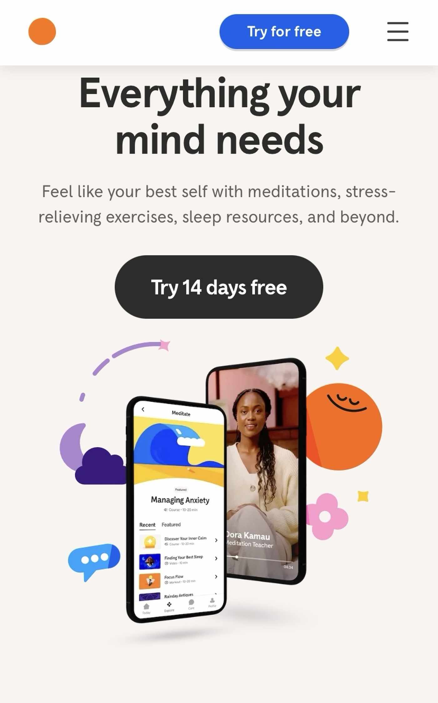
A brand that focuses on reducing stress and promoting calm should have a well-designed mobile website that causes minimal frustration. Thankfully, the mobile version of Headspace does just that. The homepage is bright and clear with lots of negative space, making it easy to find what you need.
Just below the fold, the six main reasons for using the website are displayed in large buttons with colorful icons. Clicking on each one explains how Headspace can help address that particular pain point. The whole mobile site’s navigation is intuitive and straightforward, and the bold colors and large buttons create an enjoyable browsing experience.
The Headspace mobile website design enables maximum conversion rates, with a clear call-to-action at the top of the homepage that encourages users to sign up for a free trial.

Sagmeister & Walsh’s mobile website is stunning and eye-catching, conveying everything you need to know about the brand. The company behind the book Beauty has created a mobile site that is visually impressive and fully functional, making it a joy for users to browse through.
The bold font in the menus makes a statement, and the black background and elaborate designs in the feature images provide an excellent contrast. The responsive design perfectly translates the desktop website to a handheld device.
This mobile website captures the essence of Sagmeister & Walsh without compromising user experience, resulting in a smooth and user-friendly display of their design capabilities. It’s the perfect balance of art and technology, and a brilliant example of how to do mobile website design right.
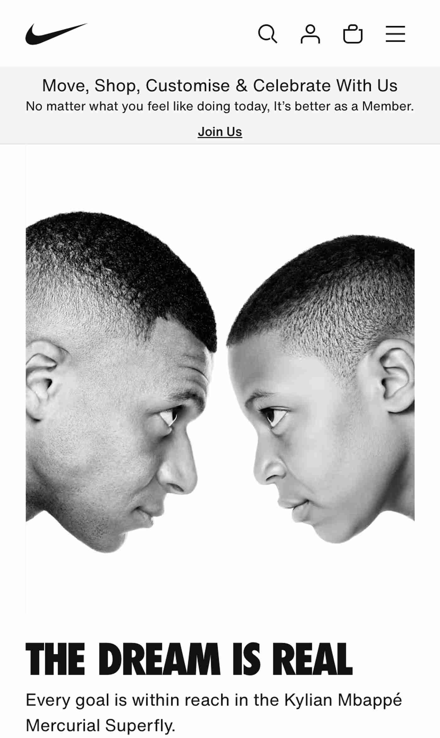
As a leading global sports brand, Nike needs a top-notch mobile website, and their design is one of the best in the ecommerce space. With an eye-catching video at the top of the page, scrolling reveals colorful images linking to their most popular categories, as well as a short menu at the bottom of the homepage.
The hamburger menu at the top right leads to a well-organized list of categories, and each page features an easy-to-use filter to narrow down the products. Within each item, a sticky “Add to Bag” button at the bottom allows users to purchase as soon as they’re ready.
The mobile website loads like a dream, and there is a clear call-to-action to become a Nike member at the bottom of the main menu. Nike’s mobile-friendly website enhances its reputation as a top performer, allowing users to make purchases on the go with no issues.
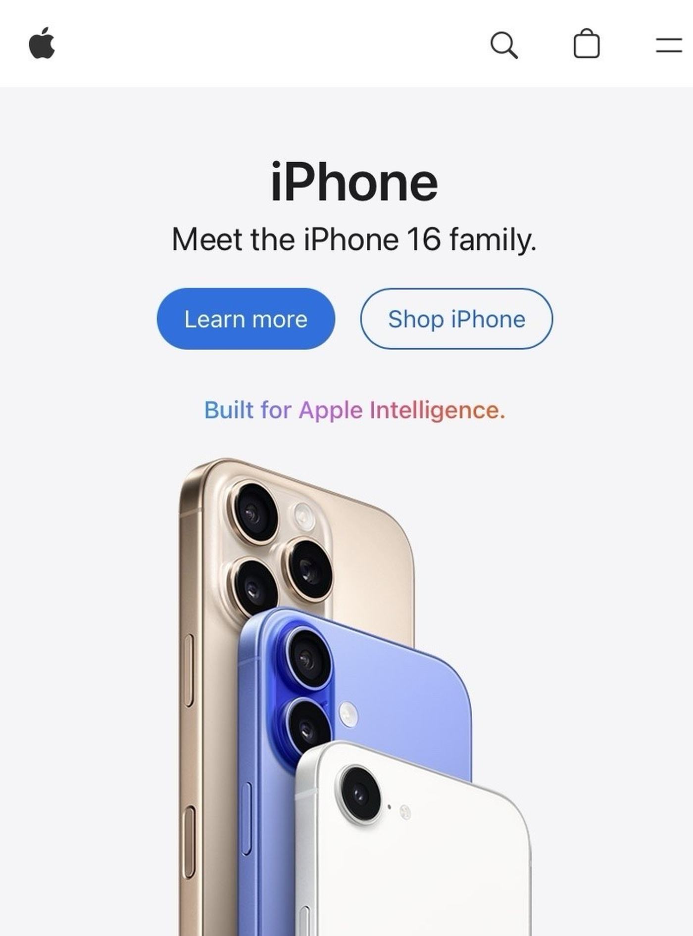
When it comes to good-looking mobile website design, you would expect Apple to be at the top of its game, and it absolutely delivers! As soon as you arrive on the homepage, you are immediately drawn in by the attractive images and the beautiful color contrasts. Of course, it helps that their products are so visually appealing to begin with.
The homepage is everything you would expect from Apple—sleek, instinctive, and functional, allowing you to access what you need seamlessly. Each device advertised on the page has a clear ‘Buy’ call-to-action button for those who know what they want and a ‘Learn More’ button for those who are simply browsing.
The instantly recognizable Apple logo in the top left corner takes you straight back to the mobile site’s homepage at any time, allowing users to return to the list of new phones whenever they want. With intuitive menus and minimalist design, Apple is about as good as a mobile website gets.
Sign up now: Start a 7-day free trial with Friday.
Having a fully responsive mobile website design is no longer optional. Luckily, there is no shortage of excellent web designs out there to inspire you. From intuitive menus to consistent CTAs, the best desktop and mobile websites all share a few key features, and adding them to your mobile site makes all the difference.
Our top 10 examples highlight what works on a mobile screen. Use these insights to make focused improvements and build a site that meets real user needs.